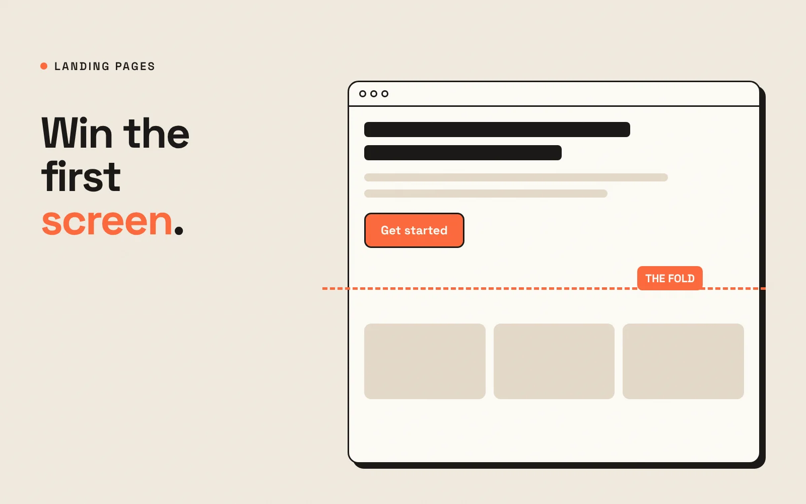
“Above the fold” is the part of a page visitors see before they scroll. On a landing page, it does most of the work. People decide within a few seconds whether they are in the right place, and if the first screen does not answer that question, many of them never scroll at all.
This guide covers what the first screen of a landing page needs, what it does not, and how to check your own page in five minutes.
The job of the first screen
The first screen has three jobs, in this order:
- Confirm the visitor is in the right place. The page should match what they clicked on.
- Explain the offer. What do they get, and why does it matter to them?
- Show the next step. One clear action they can take right now.
Everything above the fold should serve one of these jobs. Anything that does not is competing for attention.
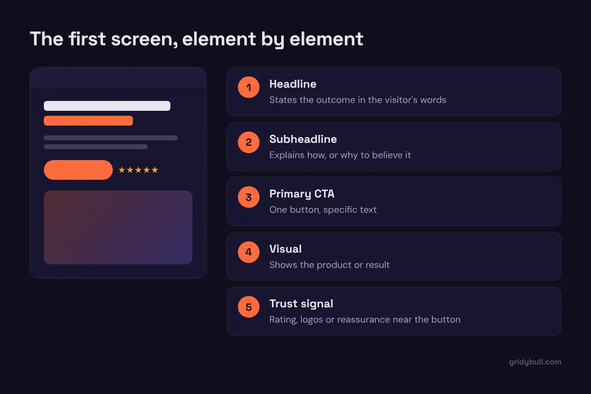
The five elements that belong above the fold
1. A headline that states the outcome
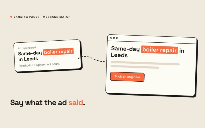
Write the headline in the visitor’s language, focused on what they get: “Get more booked calls from your existing traffic” is clearer than “Next-generation conversion solutions”. If the visitor came from an ad, reuse its key words so the page feels like a continuation of the click.
2. A subheadline that explains how
One or two sentences that answer the natural follow-up question: how does it work, or why should I believe it? This is the right place for the method, the platform or your main differentiator.
3. One primary call to action
Give the visitor one obvious thing to do, with button text that describes what happens next: “Book a 20-minute call”, “Get the free template”, “Start my trial”. A secondary link such as “See how it works” is fine if it scrolls down the same page, but avoid two competing primary buttons.
4. A visual that shows the offer
Show the product, the result or the experience: the dashboard, the finished design, the meal, the person. A specific image helps visitors picture the outcome. Generic stock photos add weight without adding meaning.
5. A trust signal near the button
Hesitation peaks right before a click. A short review, a rating from a platform people recognize, logos of clients you have permission to show, or a reassurance line such as “No credit card required” placed near the button can tip the decision.
What to leave out of the first screen
- Full navigation menus. Every link is an exit. On a dedicated landing page, the logo alone is usually enough.
- Sliders and carousels. Most visitors only see the first slide, and the movement distracts from the headline.
- Long paragraphs. Details belong further down, where interested visitors go looking for them.
- Multiple offers. If you have two offers, build two pages.
- Heavy animations and autoplay video. They slow the page down, especially on mobile, where speed matters most.
Design for mobile first
On a phone, the first screen is small. The headline, a short subheadline and the button should all fit without scrolling. That usually means:
- A shorter headline than you would use on desktop, or a smaller font size that is still easy to read.
- The visual placed below the button instead of beside it.
- A full-width button that is easy to tap with a thumb.
Check the page on a real phone, not just a resized desktop browser. Browser bars and cookie banners take up more space than you expect.
A five-minute first-screen test
Show the first screen to someone who has never seen it, for five seconds. Then ask:
- What is this page offering?
- Who is it for?
- What would you do next?
If they cannot answer all three, the first screen needs work. Start with the headline, because it does the heaviest lifting.
Common questions
Is “the fold” still relevant when everyone scrolls?
People do scroll, but they scroll when the first screen convinces them it is worth it. The fold is less a hard line and more a test of whether your opening earns attention.
Should the form be above the fold?
For simple, low-commitment offers such as a free guide, a short form above the fold works well. For higher-commitment offers such as a sales call, it is often better to place the button above the fold and the form after you have explained the value.
Get the first screen right and the rest of the page has a chance to do its job. Get it wrong and the rest of the page rarely gets read.