A landing page has one job: get a visitor who just clicked an ad, an email or a search result to take a single action. Book a call, start a trial, download a guide, buy a product. Everything on the page either helps that action happen or gets in the way.
That sounds simple, but most landing pages we audit try to do too much. They borrow the homepage navigation, list every service, and end with three different buttons. Below is the structure we use when we build landing pages on Unbounce, Instapage, HubSpot, WordPress or any other platform, section by section, with the reasoning behind each choice.
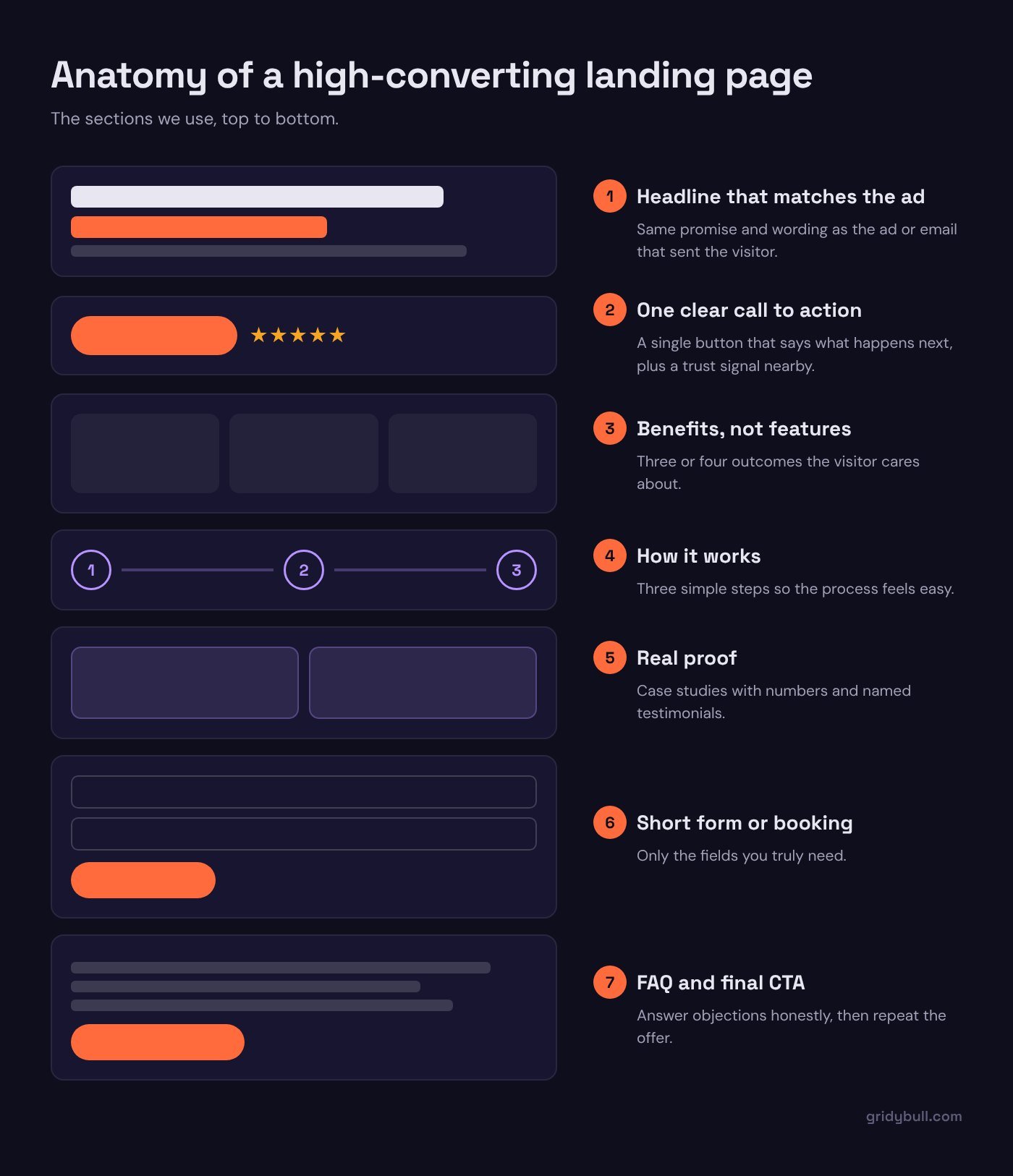
Start with one goal and one audience
Before writing a headline, answer two questions in one sentence each:
- Who is this page for? Not “small businesses”, but “owners of dental clinics who are running Google Ads for the first time”.
- What should they do next? One action. If you have two offers, build two pages.
These two answers decide your headline, your proof, your form fields and your button text. When a page converts poorly, the cause is very often that nobody wrote these sentences down.
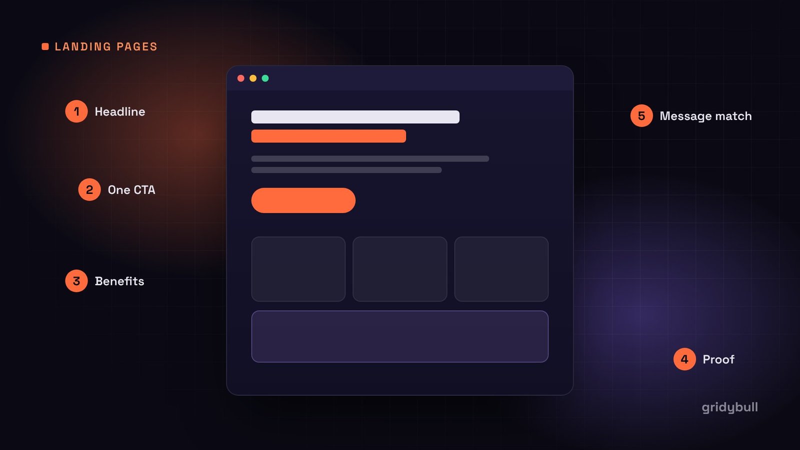
Message match: keep the promise the ad made
The fastest way to lose a paid visitor is to break the promise that made them click. If your ad says “Free Shopify speed audit”, the landing page headline should say almost exactly that, not “Welcome to our agency”.
Check three things against the ad or email that sends traffic to the page:
- The headline uses the same core words as the ad.
- The offer (price, discount, free trial, deadline) is identical.
- The visual style feels like the same brand, so people know they are in the right place.
If you run several ad groups with different angles, it is usually worth building a variant of the page for each one. Most landing page builders make this quick with duplicate pages or dynamic text replacement.
The above-the-fold section
This is the part visitors see before scrolling, and it carries most of the weight. It needs five elements:
1. A headline that states the outcome
Say what the visitor gets, in their language. “Launch your coaching funnel in two weeks” is clearer than “Innovative funnel solutions”. Specific beats clever.
2. A subheadline that explains how
One or two sentences that answer “how does that work?” or “why should I believe it?”. This is where you mention the platform, the process or the main differentiator.
3. One primary call to action
Use button text that describes what happens next: “Get my free audit”, “Book a 20-minute call”, “Start the free trial”. Avoid vague labels like “Submit” or “Learn more”.
4. A supporting visual
Show the product, the result or the person. A screenshot of the finished dashboard, a photo of the meal, the actual checklist. Generic stock photos of people shaking hands add weight without adding meaning.
5. A trust signal close to the button
A short review, a star rating from a platform people recognize, client logos you have permission to use, or a reassurance line such as “No credit card required”. Place it near the button, where hesitation happens.
Remove exits and distractions
A landing page is not a website. Take out anything that leads away from the goal:
- Remove the main navigation menu, or reduce it to the logo only.
- Avoid linking to your blog, social profiles or other services in the body.
- Keep the footer minimal: legal links are fine, a full sitemap is not.
Every extra link is a door out of the room. Some visitors will use it and not come back.
Build the body around objections
Below the fold, your job is to answer the questions that stop people from clicking. Write down the five objections you hear most on sales calls and give each one a section. A typical order:
- The problem: show you understand the situation the visitor is in.
- The solution: how your offer fixes it, in three or four clear benefits.
- How it works: three or four simple steps, so the process feels easy.
- Proof: case studies with real numbers, testimonials with names and roles, screenshots of results.
- What is included: deliverables, timeline, and what the visitor needs to provide.
- FAQ: price, contracts, guarantees, support. Answer honestly.
- Final call to action: repeat the offer and the button.
Repeat the main button after each major section, so nobody has to scroll back up when they are ready.
Forms: ask only what you need
Each extra field asks the visitor for a little more effort. For a first contact, name and email are often enough. If your sales team needs qualifying information, such as budget or company size, consider:
- A two-step form: email first, details on the next screen.
- Dropdowns instead of open text fields where possible.
- Clear labels above each field, and a short note about what happens after submitting.
Then test the form yourself on a phone. A surprising number of forms break on mobile, have tiny tap targets, or send leads nowhere because an integration was never connected.
Speed and mobile are part of the design
Paid traffic is expensive, and much of it arrives on phones over mobile data. A slow page wastes that spend before the visitor sees your headline. Keep these habits:
- Compress images and serve modern formats such as WebP.
- Avoid heavy sliders, autoplay videos and large animation libraries above the fold.
- Limit third-party scripts: every chat widget, heatmap and pixel adds load time.
- Design the mobile layout deliberately, not as a squeezed desktop page.
Run the page through Google PageSpeed Insights before launch and fix the largest issues first.
Tracking before traffic
Before the first visitor arrives, make sure you can measure what happens:
- Conversion events fire on the thank-you page or form submission, not on page load.
- Ad platform pixels and your analytics tool record the same conversion.
- UTM parameters are added to every ad and email link.
- Leads arrive in your CRM with the source attached.
Without this, you cannot tell which ad, audience or page variant is working.
Test one change at a time
Once the page has steady traffic, improve it with A/B tests. Start with the elements that affect most visitors: the headline, the offer, the hero visual and the main button text. Change one thing per test, and let the test run long enough to reach a meaningful number of conversions before deciding.
A quick pre-launch checklist
- The headline matches the ad or email that sends traffic.
- There is one goal and one primary button.
- Navigation and unrelated links are removed.
- Proof is real, specific and close to the call to action.
- The form has the minimum fields and works on mobile.
- The page loads quickly on a phone.
- Conversion tracking is tested end to end.
Get these basics right and you have a page worth sending traffic to. Then let the data tell you what to improve next.