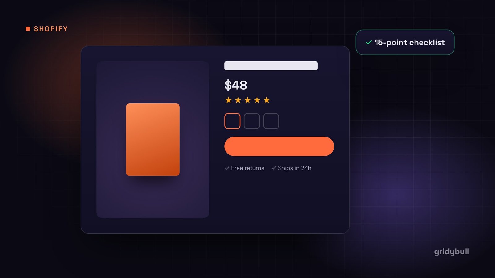
Your product page is where a browser decides to become a buyer. Ads, emails and collection pages can bring people there, but if the product page leaves questions unanswered, most visitors simply leave.
This checklist covers the 15 elements we review on every Shopify product page we build or improve. You do not need all of them on day one, but each one you add removes a reason not to buy.
Above the fold: the first five seconds
1. A clear, descriptive product title
Say what the product is in plain words before anything clever. “Organic Cotton Crew Neck T-Shirt” helps shoppers and search engines more than “The Everyday”.
2. Large, high-quality images
Show the product from several angles, close up on materials and details, and in use. Keep a consistent background and aspect ratio so the gallery feels tidy. Let shoppers zoom on desktop and swipe on mobile.
3. The price, clearly displayed
Put the price right under the title. If there is a sale, show the original and the reduced price together. If you offer payment in instalments, mention it near the price.
4. Visible ratings near the title
A star rating and review count under the title signals social proof before the shopper scrolls. Link it to the full reviews section further down.
5. One obvious Add to Cart button
Make it the most prominent element on the page, in a contrasting color, with text that does not change unexpectedly. On mobile, consider a sticky Add to Cart bar that stays visible while scrolling.
Removing doubt before the click
6. Simple variant selectors
Use swatches for colors and buttons for sizes instead of dropdowns where possible. Show which options are sold out instead of hiding them, and update the images when a variant is selected.
7. A size guide or fit notes
For clothing and shoes, a size guide next to the size selector reduces returns and hesitation. Fit notes like “runs small, size up” are even more helpful.
8. Shipping and returns, in one line
Shipping costs are one of the most common reasons people abandon carts. State delivery times, shipping costs or thresholds and your returns policy right under the button, for example: “Free shipping over $50. Free 30-day returns.”
9. Trust signals near the button
Secure checkout, accepted payment methods and guarantees all belong close to Add to Cart, where hesitation happens. Keep them small and tidy rather than covering the page in badges.
10. Stock and delivery estimates, when they are true
“Order in the next 3 hours for dispatch today” or “Only 4 left” can help, but only when accurate. Fake urgency damages trust quickly once shoppers notice.
Below the fold: answering every question
11. A benefit-led description
Lead with what the product does for the customer, then list specifications. Use short paragraphs and bullet points so the description is easy to scan on a phone.
12. Organized details in tabs or accordions
Materials, care instructions, dimensions and ingredients can live in collapsible sections. This keeps the page clean while still answering detailed questions.
13. Real customer reviews with photos
Reviews are often the most persuasive part of the page. Encourage customers to add photos, show the overall rating breakdown and do not hide critical reviews; a mix of opinions looks more believable.
14. A short FAQ
Collect the questions your support team hears about this product and answer them on the page. Every answered question is one less email and one less abandoned visit.
15. Related products and bundles
“Complete the look”, “Frequently bought together” or accessories can raise order value. Keep the suggestions relevant and limited to a handful of products.
Do not forget speed and mobile
Most Shopify traffic arrives on phones. Every app you install can add scripts to your product pages, so review apps regularly and remove the ones you no longer use. Compress images, avoid autoplay video above the fold, and test the page on a real phone, not just a desktop browser window.
How to use this checklist
- Open your best-selling product page on your phone.
- Go through the 15 points and mark each one as done, partly done or missing.
- Fix the missing items above the fold first, because they affect every visitor.
- Change one thing at a time and watch your add-to-cart rate in Shopify analytics.
Small improvements on the product page add up, because every sale passes through it. If you would like a second pair of eyes, we are happy to review your product page and point out the quickest wins.